Magnum Ice Cream website redesign
Role: Senior UX Writer
Brief: Develop a new central digital identity and user experience that can be rolled out globally
Responsibilities: Creative strategy, branding, content strategy, content design, copywriting, UX design, UI design


Introduction
Blessed with a premium identity but little online presence, the brand wanted to bring its offline to life online. Not to boost sales though. It was purely experiential.
SapientNitro invited me to work on the brief and manage the output of 3 writers.
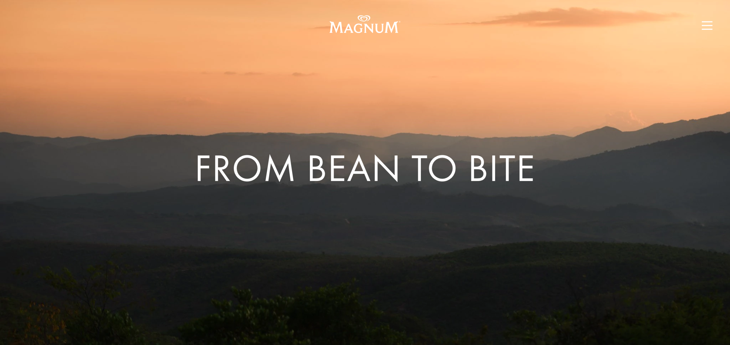
Creative and UX Vision
The existing visual branding was elevated for digital to enable this glamorous, elegant site design. The verbal identity did need more of a revamp though.
First, I audited site content to assess its themes, messages and style - mainly dry product descriptions and corporate ‘about us’ blurb.
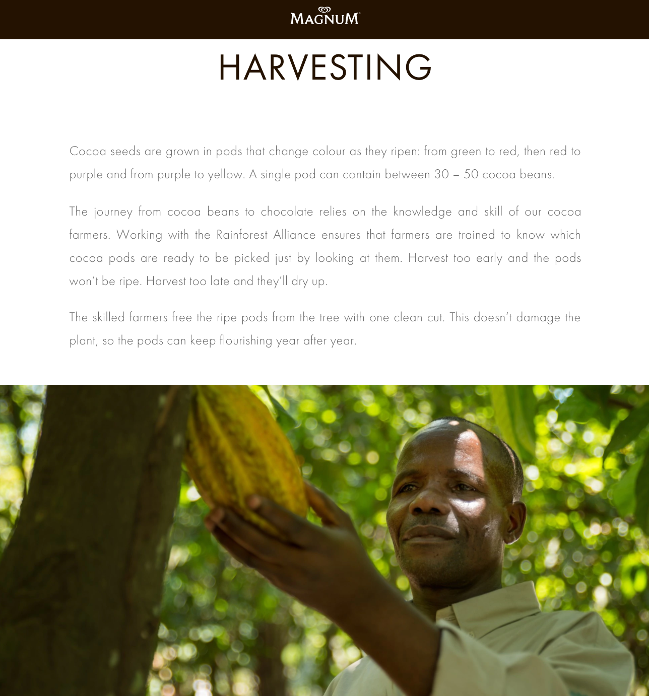
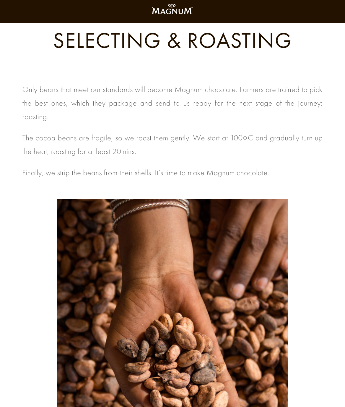
I then devised a concept to compliment the visual style…’unwrappable content’ that unveils layers of rich brand stories that are as moorish as the ice cream itself.
This concept centres around a communications approach that helps audiences indulge in the brand’s values, methods, campaigns and flavours.
It couldn’t be half as messy though. The architecture, content and UI had to be universal enough for localisation across 35 markets from Romania to Venezuala.
Creative and UX execution
Content strategy
I developed a digital tone of voice and an editorial style guide to help standardise and govern all future content creation.
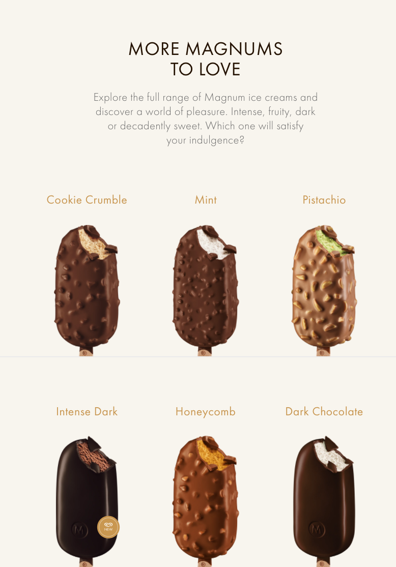
My team of writers then started writing the words - from microcopy and nomenclature to product descriptions and editorial articles.
I oversaw all content output, and wrote the examples you see here. I also helped localise the site across other non-English speaking markets, creating guidelines about page layouts and terminology.
Information architecture and UI design
Alongside Magnum’s brand and PR teams, I developed a new series of brand and product topics and messages to replace existing content.
I then rolled these into a thematic architectural framework to create the site’s taxonomy, navigational structure and page layouts.
An uncluttered long-scroll UI was designed intentionally to compliment the ‘unwrappable content’ concept, balanced with simplicity for the different digital maturities of global audiences.